FinTech Case Study: How shifting mental models are changing our expectations for mobile banking apps.

Project Brief
Pick a banking app of your choice. You have been briefed to revamp the account dashboard landing page across desktop and mobile to further enhance the user experience for a broad age group.
I chose Canadian Imperial Bank of Commerce (CIBC).
Target Audience: People with personal accounts between the ages of 18–55+
The Task
Increase retention and further conversion across mobile and desktop device.
The mission statement of CIBC
CIBC’s mission is to be the leader in client relationships. To build the most trusting and enduring client relationships by putting clients at the centre of all we do.
Since CIBC’s mission is to build the most trusting and enduring relationships. I decided to look deeper at how to increase satisfaction and further conversion across mobile and desktop apps.
Research
- Competitive Research & Analysis
- Background Research
- Surveys
Competitive Research & Analysis
I researched and chose some of the most popular Canadian banks and did the analysis with my cohort we contrasted and compared banking apps. This was analyzed and compared based on UI and the kind of features each mobile banking app offers.


Based on this Analysis, I was able to take the similarities and differences of the mobile apps and made some interesting connections.
- Tools in a mobile banking app that guide customers’ daily financial choices are becoming a necessity.
- Because they are becoming a necessity this results in a shift in the customer’s mental models.
As everything becomes digital, there are apps for everything. Banks must prove themselves useful and committed to customer satisfaction to ensure customer loyalty.
“Old” mental model = Mobile app is just to check balances and statements. The expectation before was based on the individual customer’s level of financial literacy to make informed financial choices.
“New” mental model = Mobile app is where you check balances, create savings goals, pick which automating feature to disperse income into savings once deposited, create a budget. The expectation is now about guiding customers to their goals and helping them make informed financial choices by providing the tools for efficient, effective daily banking.
What is a mental model?
According to Nielsen Norman Group, “A mental model is based on belief, not facts: that is, it’s a model of what users know (or think they know) about a system such as your website. Hopefully, users’ thinking is closely related to reality because they base their predictions about the system on their mental models and thus plan their future actions based on how that model predicts the appropriate course.”
Now, how does mental models have anything to do with the user’s mobile banking experience?
Well, according to Jakob’s law, “Users will transfer expectations they have built around one familiar product to another that appears similar.”
The shift in how banks are catering to the customer’s daily financial needs are becoming commonplace. If a mobile bank does not have a certain feature, users will find another app to fulfill that need. An example is budgeting apps such as Mint.
What does this suggest?
According to this article,
“banks overestimate their ability to encourage strong customer loyalty — while 48% of banks believe they are doing a good job to win customer loyalty, only 35% of customers agree with this statement. Ultimately, it means that if a bank doesn’t work on customer loyalty consistently, it can cause customer churn and as a result bring revenues down. That is why banks should search for all the opportunities to increase customer loyalty.”
Takeaway
The expectations for a mobile banking app to provide tools to manage daily banking are becoming greater, and there are new needs to fulfill in order to retain and satisfy current customers.
Although, CIBC’s mobile app had many helpful features they still follow the older mental model by the kind of tools they choose to provide compared to their competitors and their current UI aesthetic. There isn’t as much guidance for a customer’s financial goals or attention to the aesthetic daily banking experience of the customer.
Ideation
What features and UI choices would lead to more customer satisfaction for the CIBC mobile app?
How do I revamp the app to enhance the customer’s experience and overall satisfaction?
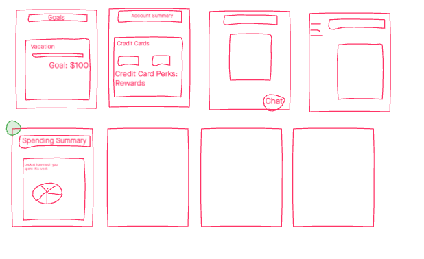
Method: Crazy eights activity with my cohort, came up with various features to include in our redesign.
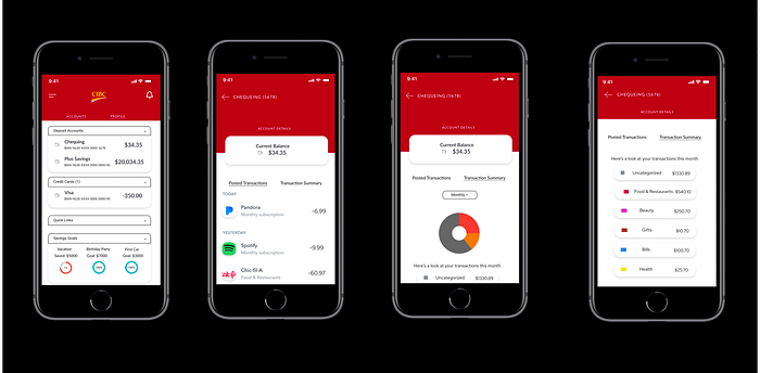
I chose to do the Spending Summary feature in my redesign.

I also reviewed CIBC’s brand identity, and their colour palette. I found that the main page, had a bolder hue than the actual application. I did a survey and found that users preferred the main brand hue over the hue used in the actual mobile app. The current app colour did not feel as vibrant.

Storyboarding
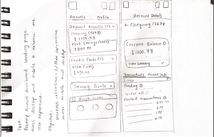
Lo-fi wireframing of how the customer journey could look like.
This includes:
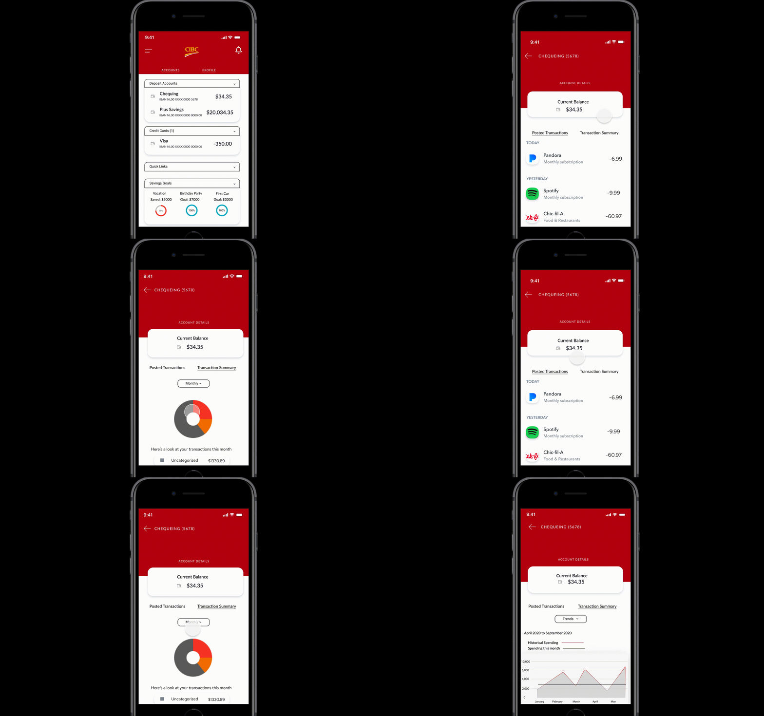
- the first page a user will view upon login, which is all of their accounts/services with CIBC.
- the account details of the chequing account
- Transaction summary from a monthly perspective
- Transaction summary from a trends perspective


Final Design + Interactive Prototype
